
Miravia. Building a brand. | Visual identity
When Alibaba decided to introduce a new full European ecommerce platform filedl with diverse world leading brands, we were require to build a new brand.
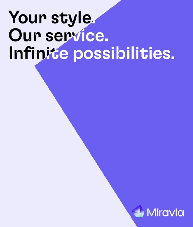
Miravia’s core it is its multifaceted business model. Thats where the prism, an inert objet that blooms into multiple shades of colours when hit by the light, came to life. A representation of an adaptative ecommerce that provides everything needed for every single shade of you.
When Alibaba decided to introduce a new full European ecommerce platform filedl with diverse world leading brands, we were require to build a new brand.
Miravia’s core it is its multifaceted business model. Thats where the prism, an inert objet that blooms into multiple shades of colours when hit by the light, came to life. A representation of an adaptative ecommerce that provides everything needed for every single shade of you.
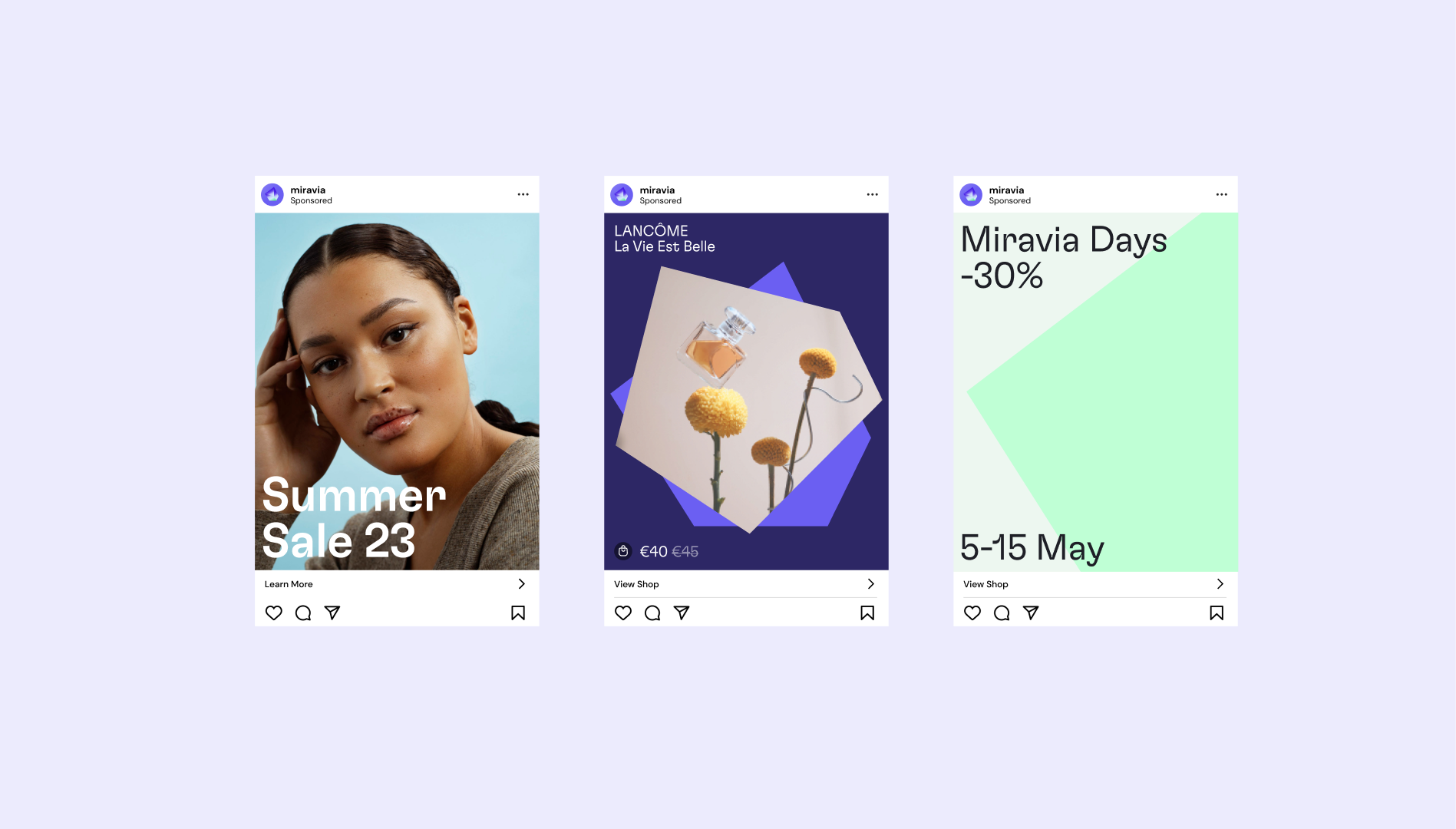
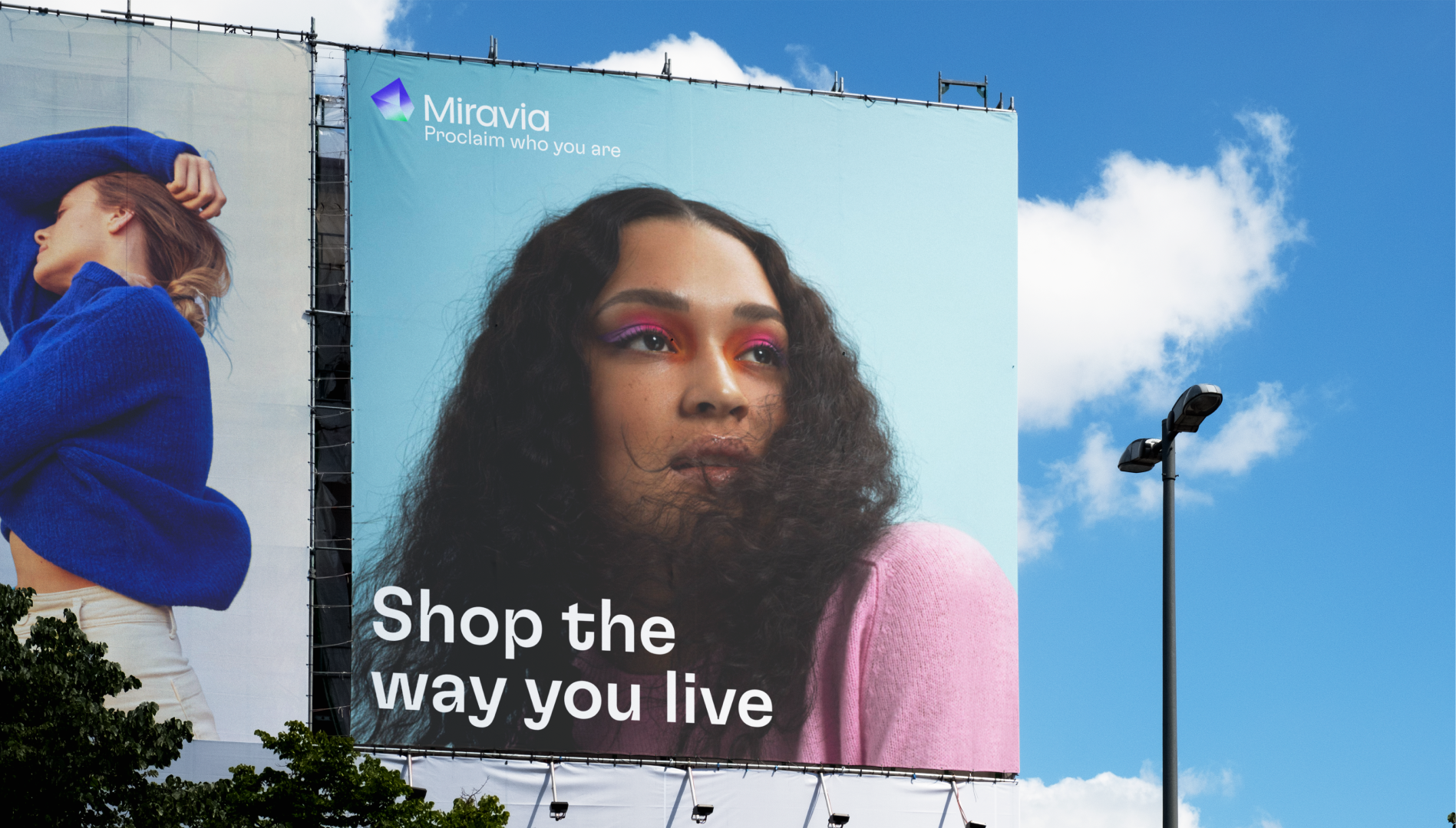
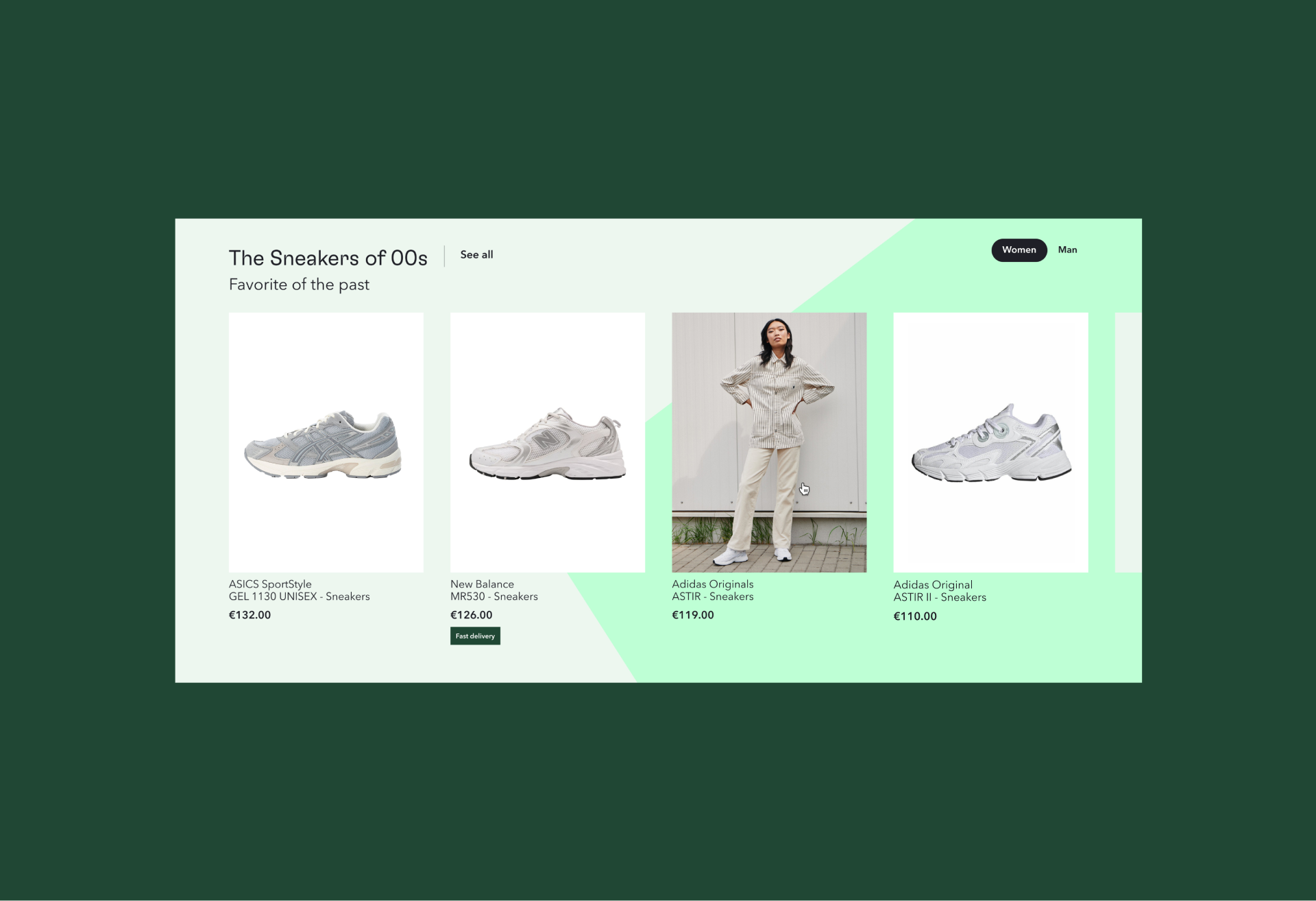
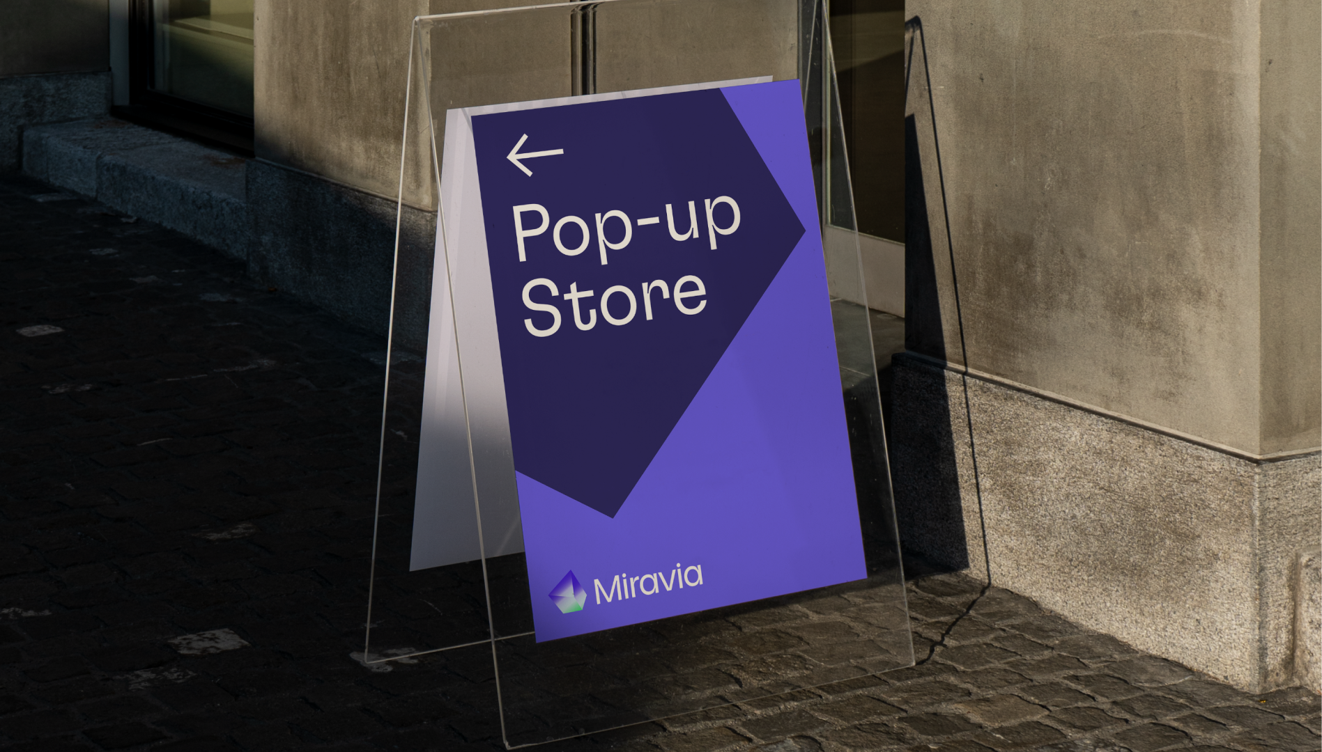
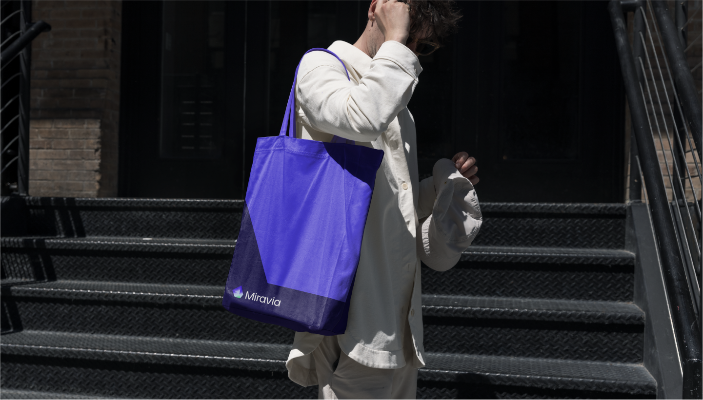
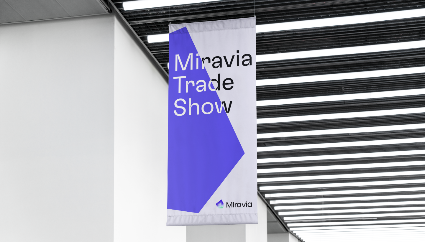
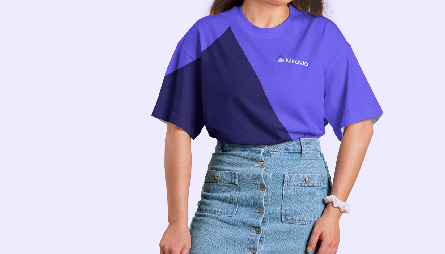
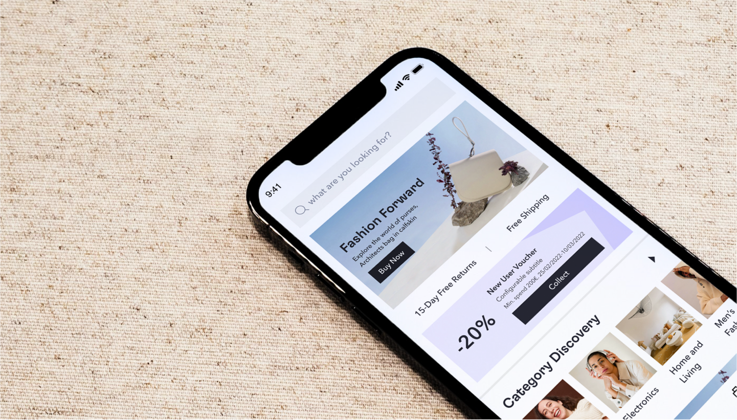
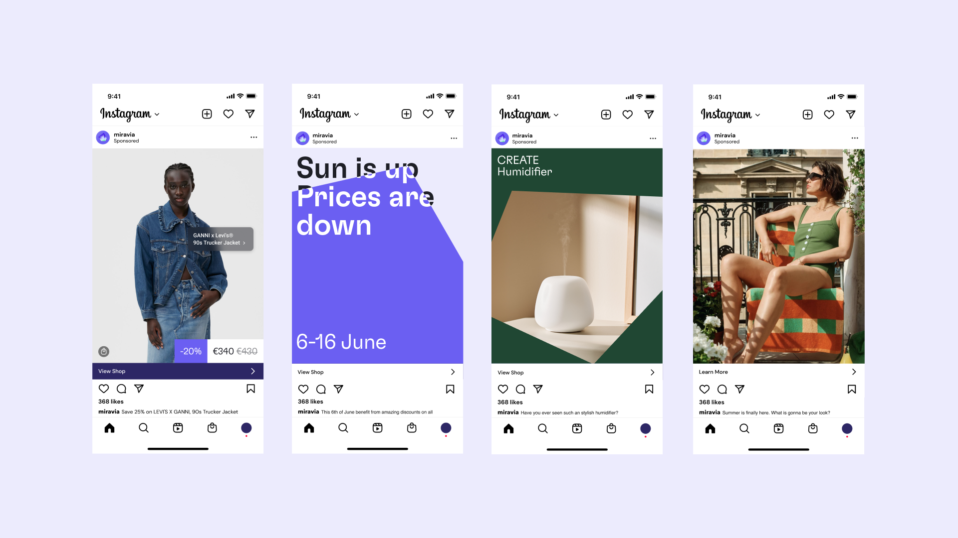
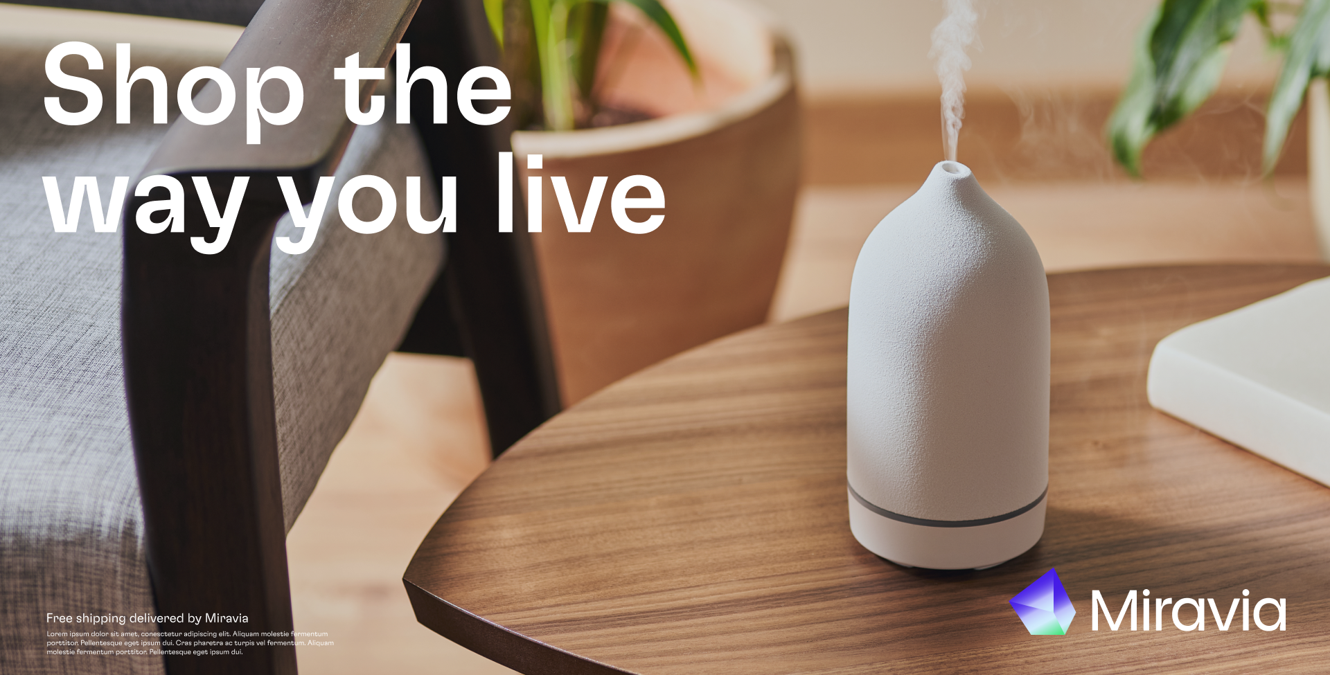
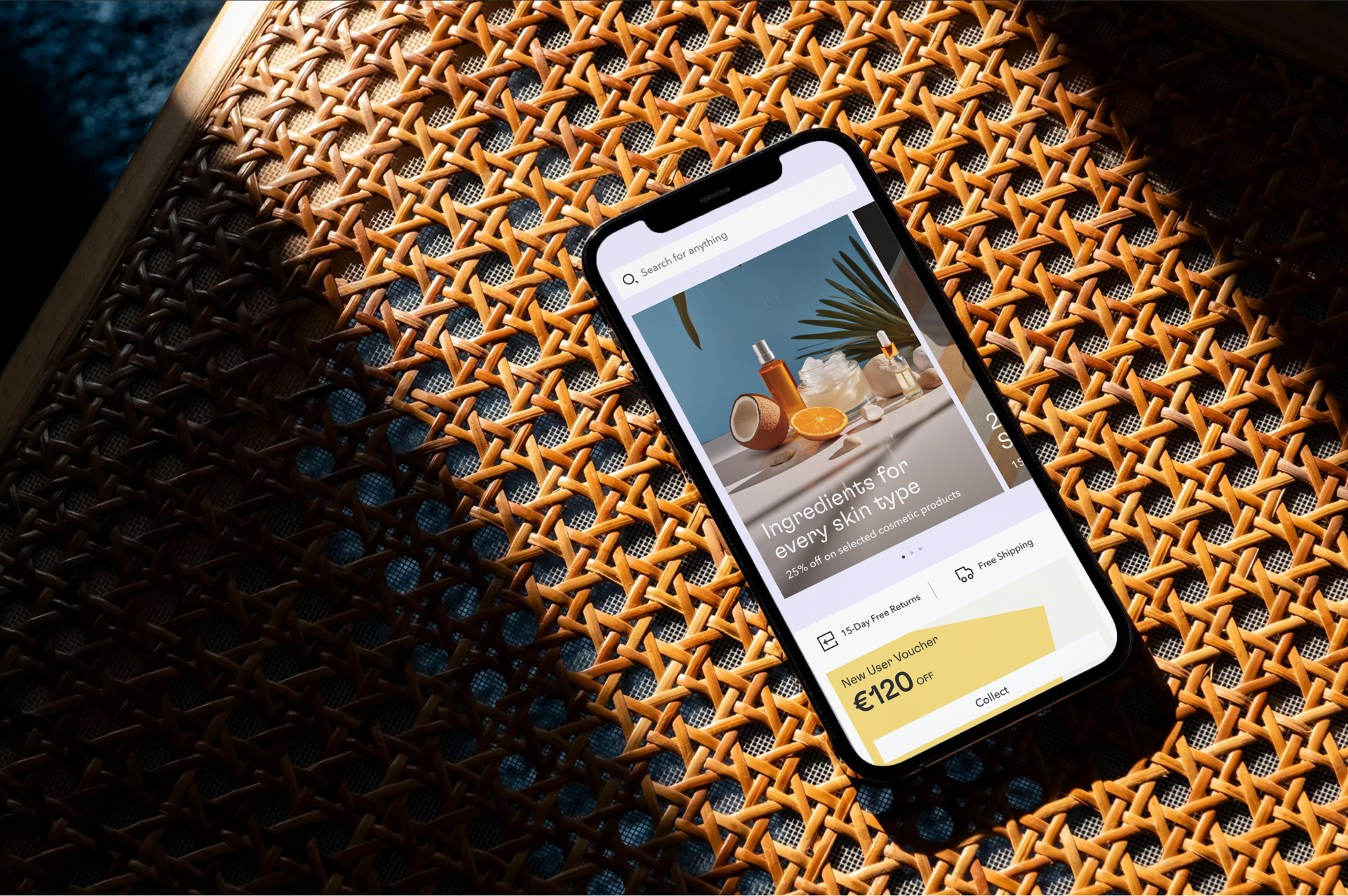
Later, in conjunction with AKQA's Amsterdam and Copenhagen offices, we created a flexible design system for Miravia to cater to its varied audience.
Every element of the identity and design system allows Miravia to adapt and shape-shift to reflect the diverse needs of its wide-ranging audience. Defined in over 160 pages of extensive guidelines, these elements give Miravia a distinctly recognisable but flexible identity.
Every element of the identity and design system allows Miravia to adapt and shape-shift to reflect the diverse needs of its wide-ranging audience. Defined in over 160 pages of extensive guidelines, these elements give Miravia a distinctly recognisable but flexible identity.


Branding impact so far:
- Executional brand memorability:
-
Branding engagement: 4 (3.80 norm)
-
Brand Predisposition persuasion: 3.15 (2.71 norm)
-
Brand Predisposition Affinity: 69.76 (68.16 norm)
-
Brand difference: 3.58 (3.55 norm)
- Visual consistency achieved through +20.000 assets successfully executed under the threshold of the Miravia visual system


Title: Miravia. Building a brand.
Product: Miravia
Client: Alibaba
Output: App, Print, Social Media
Role: Brand Design Director
Tags: Visual identity
Product: Miravia
Client: Alibaba
Output: App, Print, Social Media
Role: Brand Design Director
Tags: Visual identity