Coup de Tête | Visual identity
In the french language Coup de tête means three things: a head-butt, a spur-of-the-moment impulse, and it is the title of a well known french film from the 60’s. This parisian bistro of the same name, imagined by Lorraine Sourdille, incarnates these three meanings to a perfect T.
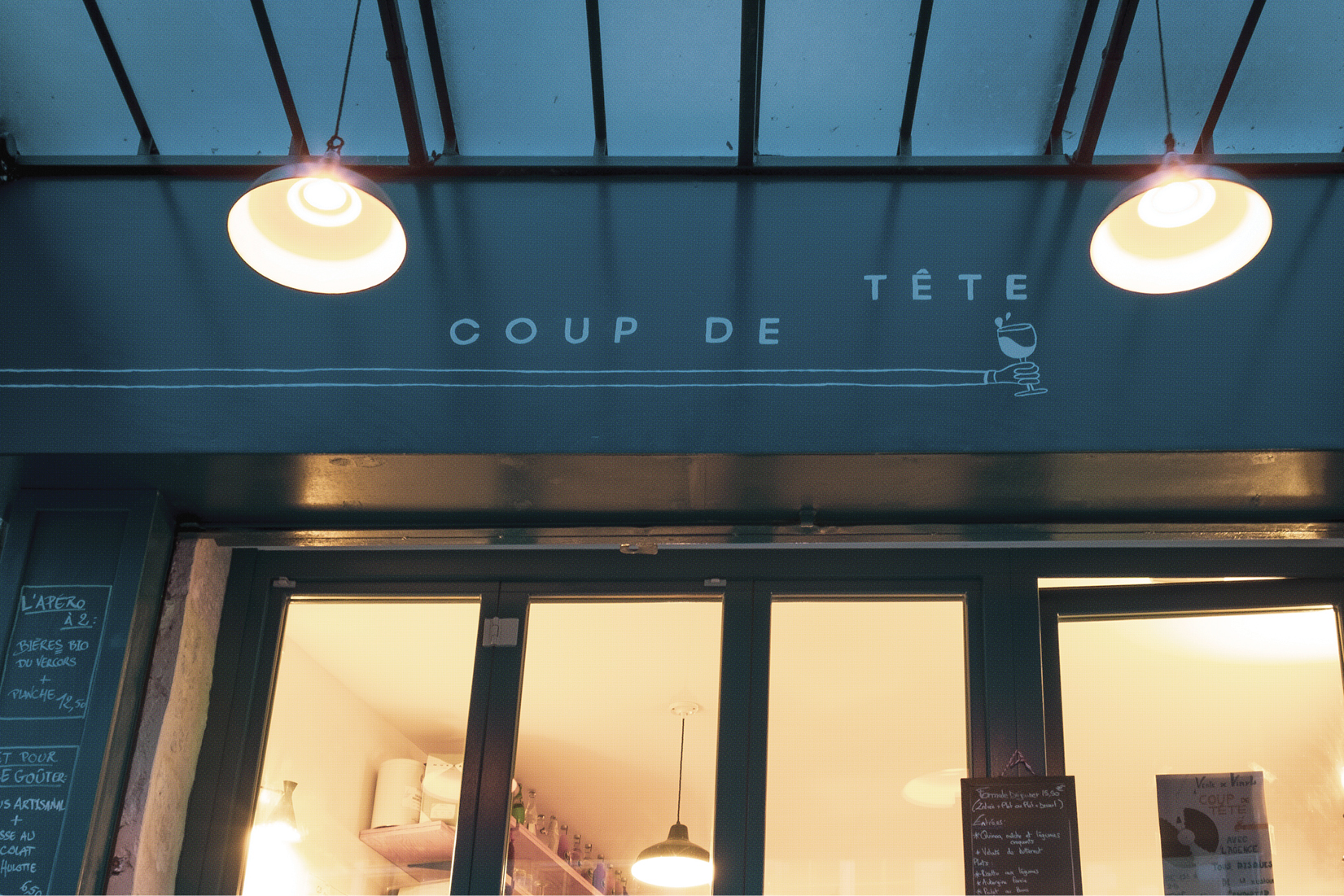
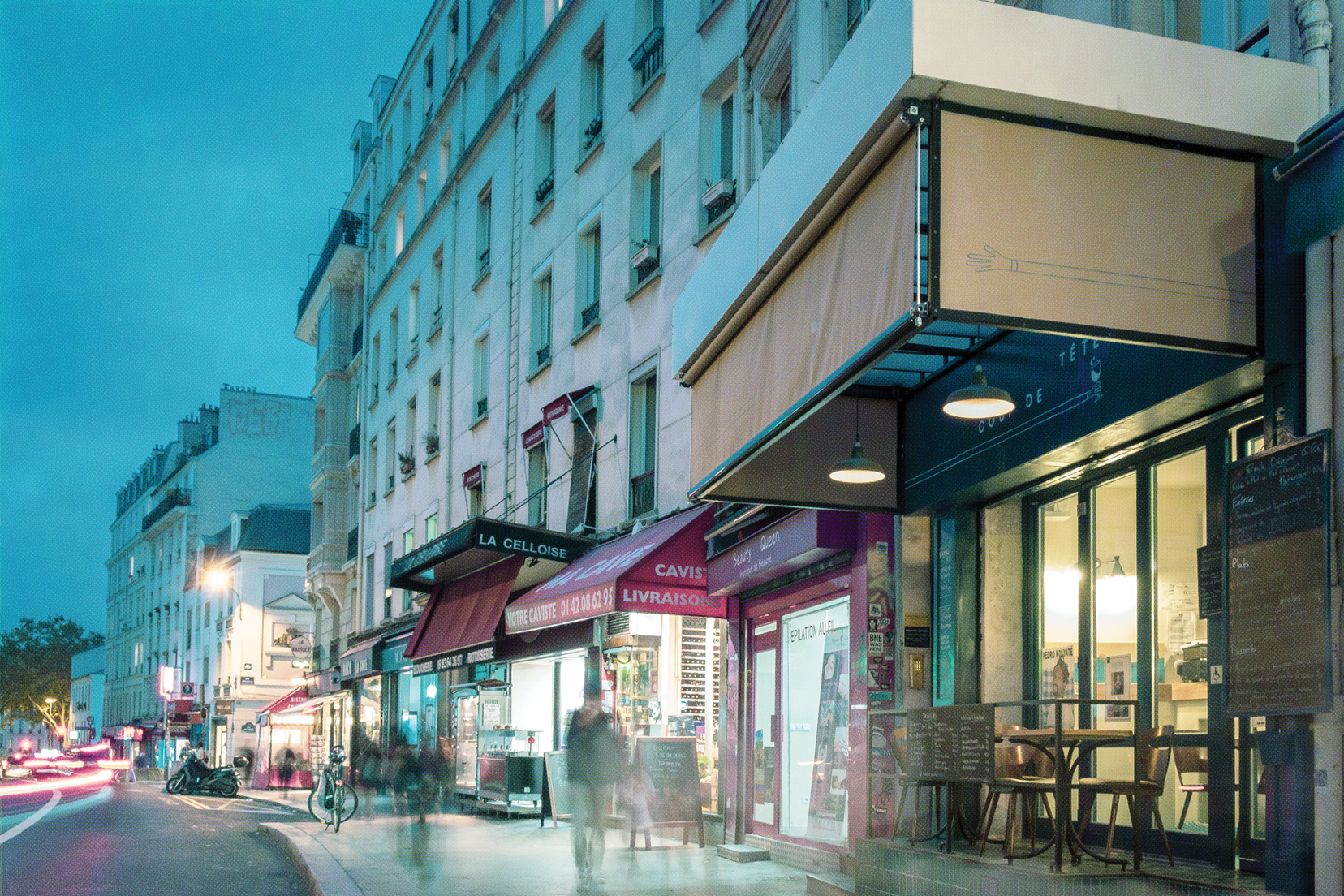
Formerly a fishmonger, the restaurant stands out from the outside with its huge but invinting canopy. Once inside we are hit by an extraordinary welcoming atmosphere, highlighted by a very carefully and well selected decoration that makes every corner in the restaurant unique in way that only french know how to do. Working closely with Lorraine and the team of interior designers we had the chance to develop the art direction for this very special place.

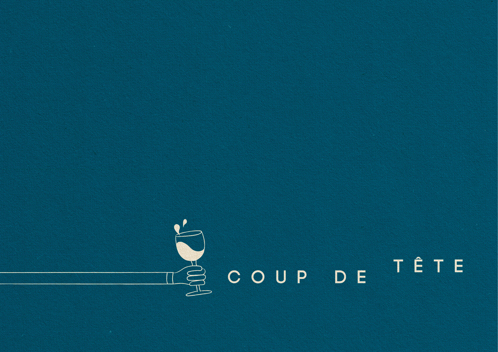
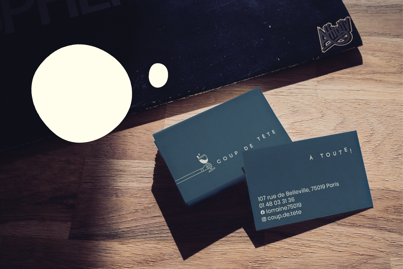
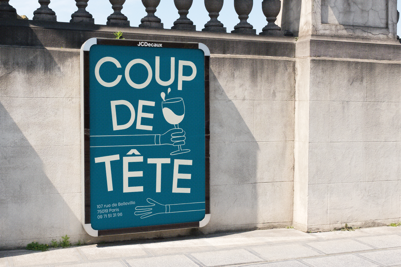
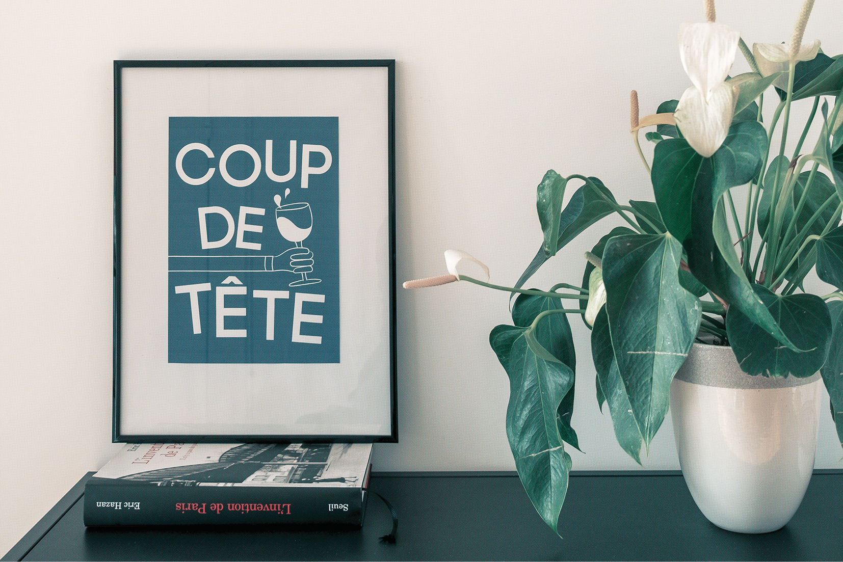
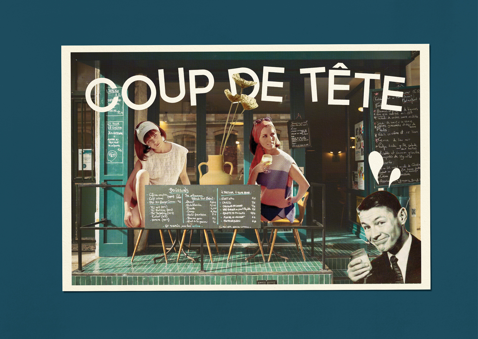
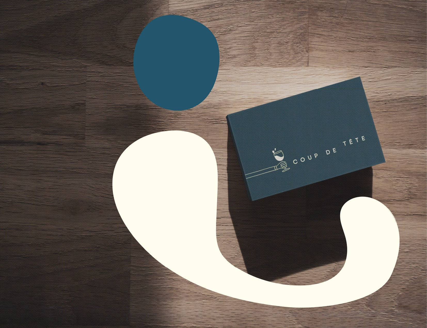
The visual identity is a result of all the ideas above. Inspired by the “nouvelle vague”, the logo revolves around a hand-drawn and playful hand cheering a glass of wine, inviting us in. An also customised and hand-drawn typography evolves to be adapted to different sizes and formats (restaurant cards, promotional posters, bespoke postcards...), and everything is highlighted by little touches of abstract shapes that evokes the spontaneous spirit of Coup de Tête.
With an extensive and more than interesting handpicked selection of wines, a lovely food menu and with its approchable customer service, there is no surprise in why Coup de Tête has become one of the hot spots in the north east of Paris.


Title: Coup de Tête
Client: Restaurant Coup de Tête
Output: Branding
Role: Art Director & Designer
Tags: Visual identity
Client: Restaurant Coup de Tête
Output: Branding
Role: Art Director & Designer
Tags: Visual identity